(Please note that this article contains some jokes that may be considered offensive depending on how well tuned your sense of humor is.)
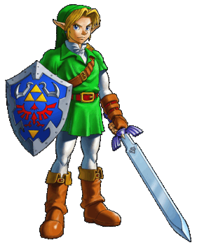
Now as The Legend of Zelda has been around for over 25 years, Link has gotten a few makeovers along with Zelda and the rest of Hyrule. With new looks, you have new opinions, and different sales numbers. As we go across the time-line of Zelda games, let's take a look at how the art style has changed as well as how the look of Link himself has changed. Full article after the break...
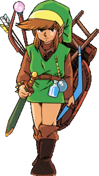
First of all, obviously we start with the very first game of them all, The Legend of Zelda, which released back in 1986. It's still a very enjoyable game to this day, and the art style on that one is pretty hard to call, because it's...well, it's 8-bit. There's not too much you can really do with 8-bit, but obviously the idea was to make everything as realistic as possible...unless you were creating a game about a movie, then obviously you try to make everything different than the movie. Anyhow, Link himself had brown hair, and he was sporting his green tunic, which he still wears today...I hope he washes it from time-line to time-line.
After that, in Zelda II: The Adventure of Link, Link himself still looks pretty well the same, he's still sporting a green tunic, he still has brown hair, and of course those manly side-burns. This time around though, he remembered to put on his pants in the morning. The land of Hyrule is still very much the same in terms of art style compared to the first game, with the biggest difference being side-scrolling, which wasn't received all that well back then.
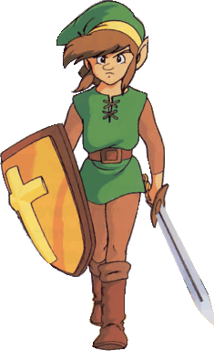
Next, Link and Hyrule both got upgraded. This upgrade of course was to 16-bit. When you first play the game, the most notable difference about Link that you can see right away is his hair. It's now pink. This was probably some ploy by Miyamoto to get girls to play the game, because all girls like the color pink, right? Well that's one theory. Another is just that there were some limitations with the SNES, but to me, that's a bogus claim, because his boots are still brown. Also, Link looks like he's packed on a few pounds since the last time he saved Hyrule...all time-lines aside, he must get bored while waiting for he next chance to save the world, so why not eat? Anyhow, Hyrule is more colorful sporting rocks with 8's on them, trees with pink leaves (definitely to attract females). Furthermore, while the land was more colorful, it was also a little more realistic.
I'm going to skip the Oracle games as well as Link's Awakening, because there were noting majorly different with those looks. Link had dark hair in Link's Awakening, and blonde in the Oracle games. He first got his blond hair from Ocarina of Time. In the tech demo for Zelda 64, Link had brown hair. Now, this is the first game Eiji Aonuma worked on, so it can be assumed he tried to explain to Miyamoto that the best way to get females to play the game, was to have a hero with blonde hair, because all of the ladies love men with with blonde hair, right? Well, Zelda's hair is also Blonde now, which could have been to attract males, because we all know that males prefer blonde haired women. Hyrule itself is again trying to look as realistic as possible.
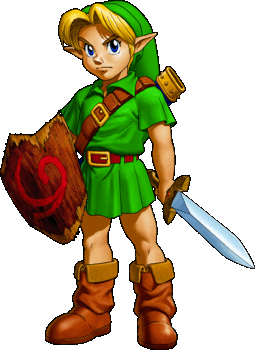
The same goes for Majora's Mask; Clock Town is striving to look real...except for that moon looming over you, but he adds a little bit of darkness to the game, which is nice. In both of these games, Link forgot to wear his pants as a child, but in Ocarina of Time, he found some white leggings inside the Temple of Time where he fell asleep for seven years. Personally, I'm surprised his tunic still fit him, but I presume there must have been some kind of laundromat in there considering if you slept in the same clothes for seven years, you might not smell very pleasant anymore. Also, Link has appeared to have lost those extremely manly side-burns that he had in previous titles.
Now we're getting closer to the common era of Zelda games with The Wind Waker. Keep in mind, that for two years prior to release, Nintendo kept showing this tech demo of a realistic looking Zelda game, but then BOOM. You get the biggest artistic change to happen to Zelda since...the beginning of time? This style was cell shaded. Try saying that five times fast. Cell shaded is more of a cartoon style, which got quite a few fans angry, since they had all been expecting a realistic looking Zelda game. They all felt that Nintendo has just taken a franchise meant for teens/adults and had now made it for kids, which wasn't necessarily true. Wind Waker itself was quite a difficult game, and would have given anyone a nice tough time. The land of Hyrule itself was flooded, and now a complete ocean, which changed everything. Link himself had his manly side-burns back, and had his leggings in check. In fact, from the two Oracle games forward, Link would always be sporting leggings.
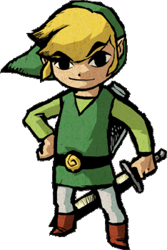
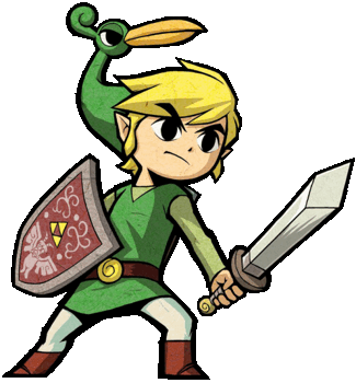
Previous to The Wind Waker, Link got his first release on the Game Boy Advance. In the game, he had some other forms of himself wearing tunics that had been seen before, all except for the purple one. The art style was pretty well a portable version of a cell shaded style, mixed with a little bit of Link to the Past. Link himself has his clothes in order, and had his side-burns to attract any passing ladies in the game.
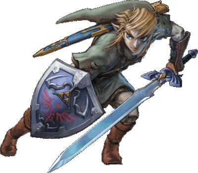
Anyhow, aside from the cell shaded style, Link did eventually return back to his realistic looks in Twilight Princess. Prior to this, he had two games, Minish Cap, and Four Swords Adventures, both of which, from an artistic standpoint, looked exactly the same in terms of how Link looked, and how the worlds looked. Portable cell shaded fun, even if Four Swords Adventures was on the GameCube. In Twilight Princess, Link did remember his pants, Zelda dyed her hair brown, and Hyrule stepped into the real world...for a brief moment.
Twilight Princess was the realistic looking Zelda game that everyone had been anticipating since the launch of the GameCube. The art style of course was realistic, the most realistic we have ever seen in a Zelda game, but even with that, there was still some criticism over the style. Because it was released on both the GameCube and the Wii, a lot of people called it a GameCube game with poor motion controls...unless you were playing the GameCube version, then it was fantastic. Link himself kept his very manly side-burns, and he was older than in previous games. This could have been another ploy to attract those of the female type. He was also taller, and more thin than usual, which gave him more human-like qualities even though he was a Hylian, not an elf. Hyrule had a lush green overworld, filled with various other realistic looking bits. However, because of this realistic style, there were some limitations that came with it. For one, Link couldn't have his exaggerated expressions that helped get his emotions across to the player as easily, so the game felt a little hollow in that aspect, but it was still a good game all around.
Now we're nearing the end of our journey across time-lines, but not so much space. The Zelda franchise spawned two DS games, which involved the same Link from Wind Waker, and the same Zelda too. The art-style was cell shaded, but not as cell shaded as Wind Waker itself, since the DS did have quite a few limitations. The games themselves were fairly well done with the art style, and were generally well received...if you liked looking like an idiot flailing a stylus on a touchscreen.
Finally, we get to Link's latest, and as stated in my previous article, musically lacking-est adventure, Link was back from his realistic looking outing in Twilight Princess, and back to something that was close to cell shading, but not quite as unrealistic. Personally, I felt that this new style was possibly the greatest, because it combined the realism of the franchise with a little exaggeration of the cell shaded style, which allowed for enough emotional expression, and still kept a serious tone about it. Notably, though, the art style was also a French Impressionist type deal, which is made of little circles of paint. Basically, the further away you are from something, the blurrier and more circular it becomes. I hated that. What did you guys think? Because I would have preferred for things in the background to stay more crisp than a stale potato chip.
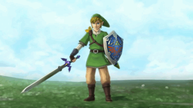
It could just be the limitations of the Wii not allowing for large render distances, so Nintendo tried that as a solution. It was a creative solution, but Hyrule...or Skyloft for the main part, could have done without it. As for Link himself, he either dyed his trousers brown, or got them dirty earlier. Now I know what you're all thinking, "But Chris, this is the first game in the time-line, he clearly used too much bleach when washing them for later adventures!" Well, I told you before we're ignoring the time-line, so deal with it. Link also kept his very masculine side-burns to clearly attract his Zelda who returned to her blonde hair.
Overall, the franchise hasn't had that many changes to its art style compared to some other games...well...Ok, maybe it has had a lot compared to some others, but it still has the same old feel that the first game had back in the day. The styles didn't change any of the characters that much over the years, and the games still contained roughly the same elements. There were always the dungeons, always the final boss, always the swords and items, but most importantly, for just about every game, there was Link, Zelda, and a whole hoard of baddies waiting to be slain.