Home > Aonuma Explains Why Fans Now Accept The Wind Wakers Art Style

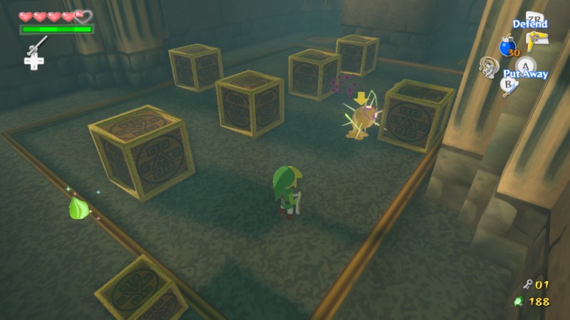
In a recent Shacknews interview - Eiji Aonuma discusses how fans initially had negative opinions about the art style of The Wind Waker and how that turned into a positive opinion over the years. Aonuma explains how using the art style in both Phantom Hourglass and Spirit Tracks helped get people more "used to" the cell shading style. Be sure to check out more quotes and information after the break.
"I think one big thing would be that we continued to use that art style in DS titles. They got to a kind of expanded userbase--a lot of people that didn't play Zelda games before. I think after seeing that, when you see Wind Waker's art style again, it becomes easier to approach because you're more used to it."
Eiji Aonuma also mentioned how Twilight Princess got tested in HD but that being in HD did not add anything to the game - it just made it look more "cleaner" and like a "master version of the game." Aonuma then went on to say that he believes a part of why fans are enjoying The Wind Waker HD's art style more is because with the power of the Wii U - they were able to make it look more like a "cartoon."
Editor Pick: How Toon Link Was Born
"Certainly, we tried. We did a test of Twilight Princess in HD. But it didn't turn into a new thing. It looked better, it looked cleaner, and it looked like a master version of the game.
But with Wind Waker, it really changed into something different--it changed into that really-looking-like-a-cartoon style we were aiming for, but we couldn't because of the Gamecube's power. I think now, the reason why people are enjoying it so much, that's a part of it."
About the Author:
Austin Dickson
Austin Dickson has been around the Zelda fandom for years. He started Link's Hideaway as a small personal project, which later turned into something of which he never thought possible. He enjoys writing articles, guides, walkthroughs, and developing the different Concealed Gaming network sites.